Whether you've got stories to tell or art to create, there's a place for you here.

Product Managers
Turning Metrics into Product Infographics
-
SDSwarnali Das- Co-founder, Chief Product Officer, Drawify
-
Nov 08, 2025 5 min read
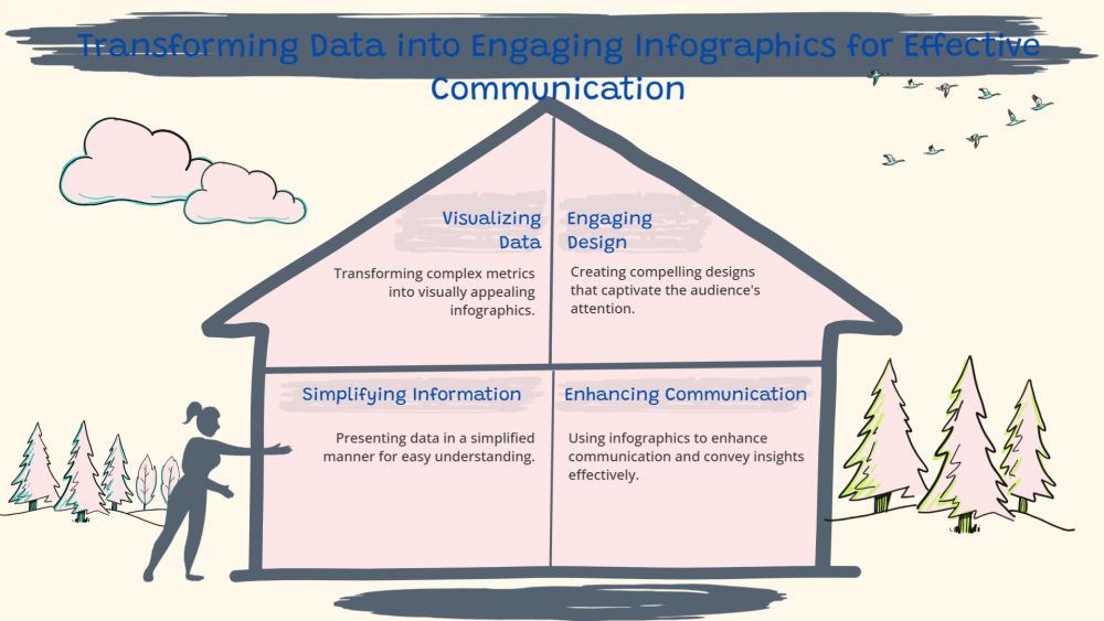
Numbers by themselves hardly motivate action in the data-driven world of today. Even though metrics and analytics are essential for making decisions, they are sometimes obscured by monotonous charts or lengthy spreadsheets. By transforming metrics into understandable, captivating infographics, visual storytelling is the secret to making data genuinely effective. Drawify excels in this situation.
Drawify turns uninteresting statistics into visually interesting stories that convey information quickly. Drawify enables you to create graphics that communicate more effectively than words or tables, whether you're a product manager presenting performance metrics, a marketing visualizing campaign results, or a designer creating dashboards for reporting.
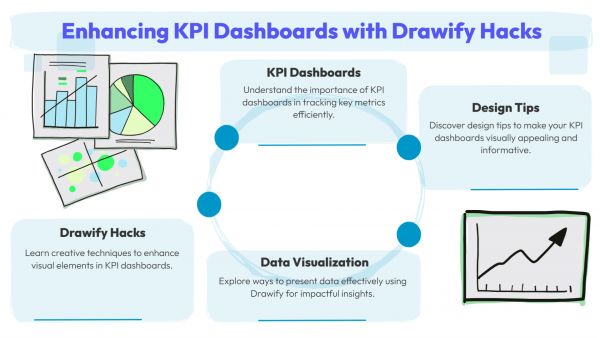
Why Visualize Product Metrics:
The well-being of your product is measured by indicators like as user growth, retention, conversions, or engagement. But not every individual in your company uses the same "data language." A well-designed infographic bridges the knowledge gap by facilitating quick understanding of insights by teams, stakeholders, and clients.
Using visual aids can increase comprehension by up to 80% and retention by 65%. In addition to making the data easier to understand, turning your KPIs into visual stories can help you make better decisions and have more productive conversations.

How Drawify Makes It Simple:
Drawify offers a library of hand-drawn graphics, editable infographic elements, and ready-to-use templates, in contrast to typical design platforms that mostly depend upon rigid templates. You don't need to be an expert designer to create visually stunning stories; you can just drag and drop.
Here's how Drawify may assist you in converting metrics into insightful product images:
- Select a Template: Start by utilising Drawify's data visualization-specific infographic templates. These consist of storytelling layouts, process maps, flow diagrams, and charts.
- Add Your Information: Enter important performance metrics, such as feature adoption, attrition rates, or user sign-ups.
- Visualize Trends: To illustrate development, difficulties, and results, use Drawify's imaginative icons and pictures.
- Customize Style: For a warm, human touch, utilise Drawify's distinctive hand-drawn features or match the colour scheme of your business.
- Share Effortlessly: You can export and include your images in presentations, reports, and social media posts.
From Data to Storytelling:
With Drawify, data is transformed from numbers into a story of advancement and promise. For instance:
- A product manager can create a visual timeline of milestones using a month's performance report.
- A marketing team can use accessible images and interesting charts to show campaign ROI.
- A start-up entrepreneur can use an innovative infographic that visually displays accomplishments to show investors growth indicators.
- Every graphic created using Drawify engages the audience emotionally in addition to providing information, something that simple charts are unable to do.
The Power of Visual Storytelling with Drawify:
Drawify is more than just another design tool; it's a platform for visual storytelling that enables teams to clearly and uniquely convey data. By combining analytics and creativity, it enables professionals to:
- Simplify complex data for wider audiences.
- Boost engagement in presentations and reports.
- Highlight key insights visually for better decision-making.
Design professionals are no longer the only ones responsible for transforming metrics into infographics. Drawify allows anyone to turn unstructured data into visually compelling stories that inspire and engage. With Drawify, you can not only explain but also display the story behind your figures, whether you're using them for public reports, investor decks, or internal dashboards.
Use Drawify to begin transforming your product KPIs into visually striking content!
Post This Article to Your Socials
Popular Topics
- Events
- Workshops
- Visual Storytelling
- How to video
- Communities
- Sketchnoting
- Templates
- UX Designers
- Agile Professionals
- Product Managers
- Freelance Graphic Designers
- Creative Tech Enthusiasts
- Online Course Creators
- Social Media Content Creator
- Creative Agency Owners
- Marketing Professionals
- EdTech Professionals
- Scrum Masters
Similar Articles
Come, Be Part of Something Special
-
Got ideas that need visual superpowers?
Jump in and start creating presentations and communications that people actually remember.
Sign In -
Are you an artist ready to grow?
Join our Drawifier family and focus on what you love most - creating art that matters.
Become a Drawifier
Get visualisation tips every week
Subscribe to the Drawify Newsletter, and feed your creativity with visualisation tips and techniques, as well as the latest Drawify workshops, news and resources.
