Whether you've got stories to tell or art to create, there's a place for you here.

Product Managers
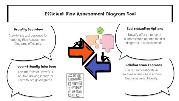
Drawify for Risk Assessment Diagrams

-
ARAnshu Raj- Founder & CEO, Drawify
-
Dec 18, 2025 5 min read
Picture this: You’ve just spent hours compiling critical risk data into a comprehensive spreadsheet. You present it to your team. Eyes glaze over! Questions multiply. And somehow, you’ve made an important topic feel even more complicated than it already was.
Sound familiar?
The truth is, most risk assessment tools aren’t built for humans—they’re built for databases. Dense rows of numbers. Technical terminology that needs constant translation. Formats that hide insights instead of revealing them.
Drawify takes a different approach. It starts with a simple premise: if your team can’t understand the risks, they can’t manage them effectively. And the fastest path to understanding isn’t through more data—it’s through better visualization.

Why Pictures Really Are Worth a Thousand Words:
Here’s the thing about visual risk assessments: they just work better. When you can actually see the connections between threats, impacts, and controls, something clicks in your brain that no spreadsheet can replicate.
Visual diagrams help your team:
- Catch potential problems before they become actual problems.
- Understand how different risks relate to each other.
- Talk about complex issues in ways everyone can follow.
- Make decisions with confidence instead of confusion.
- Avoid those “wait, what did you mean by that?” moments.
The best part? You don’t need to be a risk management expert to understand what you’re looking at.
What Makes Drawify Different:
Templates That Actually Fit Your Work:
Drawify comes loaded with templates for the risk formats you’re already using—risk matrices, FMEA diagrams, fault trees, cause-and-effect maps, and process flows. You’re not starting from a blank canvas, wondering what goes where. Just pick the template that fits your situation and start filling it in.
Hand-Drawn Style That Connects with People:
There’s something about Drawify’s hand-drawn illustrations that makes information feel more approachable. Maybe it’s because they look less corporate and more human. Whatever the reason, these visuals help people:
- Get the main idea immediately.
- Stay focused during long presentations (yes, even the 3 p.m. ones).
- Actually remember what you told them.
It turns out that a little personality goes a long way in making dry information digestible.
A Common Language for Everyone:
You know that frustrating moment when the technical team, management, and clients are all in the same meeting but might as well be speaking different languages? Drawify helps fix that.
By mapping out threat sources, impact zones, control measures, and decision pathways visually, everyone can follow along—regardless of their technical background. Finally, a way to get genuine alignment instead of polite nods that hide confusion.
Customize However You Need:
Every risk assessment is different, and Drawify gets that. You can color-code risk levels, highlight what needs immediate attention, add icons for different systems or departments, layer in detailed notes, and build diagrams as simple or complex as your situation demands.
It’s flexible enough for a quick project review or a comprehensive compliance audit.
Work Faster Without Sacrificing Quality:
Building diagrams from scratch every time is exhausting. Drawify speeds things up significantly, which means your team gets to spend less time on documentation and more time on actual risk management.
You’ll notice faster turnaround times, better consistency across different reports, fewer rounds of clarification emails, and way less of that “does anyone remember what this diagram was trying to show?” confusion.
Where Teams Are Using Drawify:
People are using Drawify for all kinds of risk work—project planning, software development risk mapping, cybersecurity threat modeling, workplace safety assessments, compliance audits, supply chain analysis, and product engineering reviews.
The common thread? They all needed a way to make complicated information clearer.
Getting Started Is Straightforward:
Here’s how simple it is:
Pick a template that matches what you’re assessing. Drop in your risk data—the likelihood, impact, causes, controls, and so on. Add illustrations that make abstract concepts concrete. Use color to show severity or urgency. Export your diagram and share it with whoever needs it.
In less time than it takes to format a decent spreadsheet, you’ve got a professional risk visual that people will actually understand.
What Sets Drawify Apart:
It’s not just about having templates—lots of tools have those. Drawify combines a huge library of quality visuals with an interface that doesn’t require training, templates built for actual business needs, customization options that let you match your brand, and that distinctive hand-drawn style that makes your work feel less robotic and more relatable.
At the end of the day, Drawify is about replacing complexity with clarity. And that’s something every team needs.
Risk assessment doesn’t have to feel like homework. With Drawify, you can turn complicated evaluations into visuals that people genuinely understand and use. Whether you’re dealing with operational risks, system vulnerabilities, or anything in between, Drawify helps you work faster and communicate better.
Clear visuals. Proactive communication. A team that’s genuinely on the same page.
That’s what happens when you make risk assessment human.
Post This Article to Your Socials
Popular Topics
- Events
- Workshops
- Visual Storytelling
- How to video
- Communities
- Sketchnoting
- Templates
- UX Designers
- Agile Professionals
- Product Managers
- Freelance Graphic Designers
- Creative Tech Enthusiasts
- Online Course Creators
- Social Media Content Creator
- Creative Agency Owners
- Marketing Professionals
- EdTech Professionals
- Scrum Masters
Similar Articles
Come, Be Part of Something Special
-
Got ideas that need visual superpowers?
Jump in and start creating presentations and communications that people actually remember.
Sign In -
Are you an artist ready to grow?
Join our Drawifier family and focus on what you love most - creating art that matters.
Become a Drawifier
Get visualisation tips every week
Subscribe to the Drawify Newsletter, and feed your creativity with visualisation tips and techniques, as well as the latest Drawify workshops, news and resources.
