Whether you've got stories to tell or art to create, there's a place for you here.

Online Course Creators
Turning Data into Progress Infographics
-
ARAnshu Raj- Founder & CEO, Drawify
-
Nov 08, 2025 5 min read
In the data-driven world of today, statistics by themselves rarely motivate action. Although charts and figures provide information, they frequently fall short of creating engaging storytelling. Progress infographics can help with that as they simplify complicated data into comprehensible visual stories that emphasize development, accomplishments, and future objectives. It has never been simpler to transform your raw data into captivating visual stories than with Drawify.
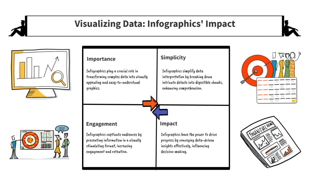
The Significance of Progress Infographics:
Infographics of progress are effective visual aids for communication. Visuals make information easier for your audience to understand, whether you're tracking project milestones, demonstrating team accomplishments, or showcasing company progress. With the use of structure, colour, and style, progress infographics streamline data storytelling rather than overloading consumers with spreadsheets or reports.
Studies show that people only recall 20% of what they read, while they remember 80% of what they see. Converting your facts into visuals enhances understanding and increases the recall value of your message.

Using Drawify to Make Data Visualization Simpler:
Without any prior design experience, Drawify enables creators, marketers, and business professionals to easily create infographics of expert quality. The platform's library of hand-drawn illustrations and editable templates let users visualize data in a way that is approachable, imaginative, and human.
Here's how Drawify can assist you in producing powerful progress infographics:
- Select from AI-powered Templates:
Pre-made infographic templates are available from Drawify, which speeds up and simplifies data visualization. Growth trackers and performance dashboards are just two examples of the layouts you can use to fit your story.
- Include Hand-Drawn Illustrations:
Use authentic hand-drawn illustrations to add a personal touch to your data instead of rigid, corporate iconography. Drawify's artistic style gives your designs a creative and approachable appeal.
- Customize with Colours and Icons:
Make your infographics exclusive to you by incorporating brand aspects, altering the colours, and selecting icons that complement your theme. The objective is to match communication clarity with design.
- Highlight Key Metrics:
To highlight significant events and accomplishments, use timelines, arrows, and shapes. Drawify allows you to focus on the most significant data or trends.
Ideal Use Cases for Progress Infographics:
- Business Reports: Visualize quarterly growth, Key Performance Indicators (KPIs), and revenue milestones in business reports.
- Marketing Campaigns: Highlight ROI, audience expansion, and performance outcomes.
- Education & Training: Show project stages, learning objectives, or student progress.
- Personal Projects: Keep a fun, visual record of your objectives, health, or artistic accomplishments.
Why Choose Drawify for Data Storytelling:
It is noteworthy that Drawify is more than just a design tool. It is a platform for storytelling that helps in the visualization of progress with character and direction. By combining creativity and clarity, you may ensure that your data inspires rather than merely informs, as opposed to depending on generic templates.
Drawify gives you the ability to convey progress in ways that appeal to both the intellect and the emotions with its user-friendly interface, extensive illustration library, and adaptable design tools.
In a world where people's attention is short, data by itself is insufficient; visual storytelling transforms figures into stories! With Drawify, you can turn complicated data into stunning, understandable progress infographics that inspire, encourage, and inform.
The next time you want to highlight progress or achievements, use Drawify to visually communicate the story rather than just displaying the statistics!
Post This Article to Your Socials
Popular Topics
- Events
- Workshops
- Visual Storytelling
- How to video
- Communities
- Sketchnoting
- Templates
- UX Designers
- Agile Professionals
- Product Managers
- Freelance Graphic Designers
- Creative Tech Enthusiasts
- Online Course Creators
- Social Media Content Creator
- Creative Agency Owners
- Marketing Professionals
- EdTech Professionals
- Scrum Masters
Similar Articles
Come, Be Part of Something Special
-
Got ideas that need visual superpowers?
Jump in and start creating presentations and communications that people actually remember.
Sign In -
Are you an artist ready to grow?
Join our Drawifier family and focus on what you love most - creating art that matters.
Become a Drawifier
Get visualisation tips every week
Subscribe to the Drawify Newsletter, and feed your creativity with visualisation tips and techniques, as well as the latest Drawify workshops, news and resources.
